

WRITING TASK ONE (ACADEMIC)
IELTS Academic Writing Task 1 asks you to write a report (not an essay) based on visual information such as a bar chart, line graph, pie chart, table, map, or flow diagram. Some exams may include more than one diagram/graph for comparison in the same answer.
ESSENTIAL INFORMATION:
-
Time: 20 minutes
-
Word count: Minimum 150 words
-
Task type: Descriptive report
-
Purpose: Summarise and compare data or describe a process/visual accurately and clearly.
YOU NEED TO:
-
Summarise the main trends, differences, or stages (depending on the visual).
-
Compare data or describe changes over time (if applicable).
-
Avoid giving opinions or analysing beyond what the data shows.
-
Use formal, objective language.
KEY SKILLS NEEDED:
-
Data interpretation and selection
-
Paraphrasing and summarising
-
Using specific language for description (see our vocabulary lists for recommended words)
-
Appropriate grammar and sentence structure (know how to use passive voice when appropriate)
-
Paragraphing and report structuring
SUGGESTED PRACTICE ACTIVITIES:
-
Analyse sample tasks and identify key features (without writing the full report).
-
Write just introductions or just overviews for a range of tasks.
-
Practice converting raw data into summaries.
-
Rewrite model answers in your own words to build paraphrasing skills.
Writing Task 1 Academic example graphs and diagrams
Below are examples of all types of visual data that come up in the IELTS Writing Academic Task 1. The graphs show information related to international students, the map is a basic example of a location and the flow diagram shows the stages of bread being made from wheat.
Scroll through the examples to see which ones you are familiar with and which ones you need more practice with.
For each type of chart/diagram there are guide questions for you to think about when completing similar questions in the exam. The writing in blue is an example of notes you might write to plan your answer, using the example graph/chart.
The key thing to remember with this task is that you do not need to describe every part of the chart/diagram in detail, it is to describe trends and key features from an objective point of view. This means you should not write your opinion - this task is purely descriptive and not explanatory.
Bar charts can either be vertical (as in the given example here), or they can be horizontal.
When you are thinking about the points to describe, consider the following questions (answers for the example are in blue):
-
What categories are being compared? students studying abroad for five different countries
-
Are the values increasing, decreasing, or remaining steady? all of them are increasing each year
-
Are there any clear highs or lows? the number for India increased most dramatically, all the statistics for China are clearly higher than every other country for each year. India moves from having the lowest number in 2010, to the second highest in 2020
-
Is the data static (one point in time) or dynamic (multiple time points)? dynamic, the data covers a 10-year period
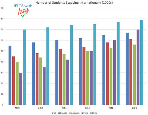
BAR CHARTS
Line graphs show changes or trends over time, so pay attention to the time period that the data is based on. Consider this, and other points below:
-
What time period is shown? 2010 to 2020, a 10-year time period
-
Which lines show a rise, fall, or fluctuation? most lines show a steady increase without fluctuations, and India shows a slightly more dramatic increase
-
Are there any crossovers or points where values are equal? India crosses over Australia, Canada and the UK, climbing from the lowest in 2010 to the second highest in 2020
-
Which trends are the most significant or consistent? India is the most significant because it has the biggest and quickest increase, all other countries increase at approximately the same pace. China remains at the top throughout
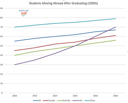
LINE GRAPHS
In this example, there is one pie chart so the only comparison needed is between the segments. However, in the exam there may be more than one pie chart to compare with similar or related data. You need to describe the largest/smallest segments, any similarities and any interesting data points. Consider:
-
What does each slice represent? the number of students from a particular country studying in Florida, USA in 2018
-
Which categories are the largest and smallest? Chinese students make the largest category and British students make up the smallest. The largest category is quadruple the number of the smallest one
-
Are you comparing one chart or multiple charts? (just one chart)
-
If there are two time points, has the proportion of each category changed? (not applicable to this chart)
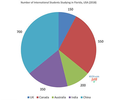
PIE CHARTS
Tasks with tables of numerical information may or may not be presented with an additional table of related information, or a related graph. Think about the following:
-
What are the categories and units of measurement? students from five different countries and the cost of international study
-
Which values are highest and lowest? the lowest is India in 2010, and the highest is China in 2020
-
Are there any clear patterns, increases, or decreases? The numbers for each country increase year-on-year, with China remaining the highest for each. India has the biggest increase overall
-
Are you comparing data across time or between groups? (both time and groups)
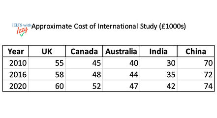
TABLES
Maps can show a variety of different areas, and are often presented as a before and after for comparison (as with the example here). You should describe major changes and the proximity of objects/buildings to each other. To plan your answer, think about the following:
-
Are you comparing different time periods or different locations? different time periods (one current and one in the future)
-
What features have been added, demolished, or modified? the car park will be moved and expanded, the rough grass patch will be reduced in size and moved, making way for a larger pond that was originally central. The sandpit will also be reduced. The wooded area will stay the same size.
-
Have land uses or functions changed (e.g., from farmland to housing)? The function of the golf course will still be the same
-
Are there changes in infrastructure (roads, transport, buildings)? there will be no new roads or buildings
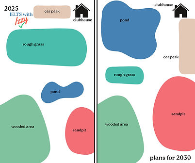
A map of a golf course in 2025 and the plans for 2030
MAPS
Flow diagrams (or process diagrams) show how something works or how it is made. You should describe this in a clear and logical way, thinking about:
-
Where does the process start and end? it starts with the wheat being sown and ends when the bread is placed on shelves for sale
-
How many stages are there? there are twelve steps
-
Are there any decisions, loops, or branches in the process? each step follows the last with no detours or loops
-
Is the process cyclical (repeats like the water cycle) or linear (one direction like a food recipe)? it is linear as the end product cannot be used to begin again

FLOW DIAGRAMS
Example answers for IELTS Writing Task 1 Academic (Band 6 & 9)
The two answers here both describe this pie chart. One of them is band 6, one of them is band 9 - can you tell the difference?
Scroll down to see which one is which, and how you can improve your writing for this task.


Band 6 Sample Answer Writing Task 1 Academic
Did you guess right?
Band 6 answers usually:
-
Have a clear but simple structure
-
This answer has defined paragraphs for generalised and then more detailed description
-
-
Include some key data
-
The biggest vs smallest comparisons have been recorded
-
-
Have limited comparisons or less precise language
-
More in depth comparison is missing (see band 9 answer)
-
Vocabulary is vague for comparisons
-
-
Sometimes have grammar or vocabulary repetition
-
"students" "number of" "countries" are repeated several times
-

Band 9 Sample Answer Writing Task 1 Academic
Band 9 answers:
-
Have a clear and sophisticated structure
-
There is smooth progression of ideas, with effective use of linking phrases.
-
Paragraphing enhances clarity and flow.
-
-
Include all key data with precise and relevant detail
-
Data has been selected strategically, not mechanically, for this answer. Instead of listing figures, they are used to illustrate trends.
-
-
Make clear, accurate, and insightful comparisons
-
The language describing the trends describes the degree and proportion, rather than basic comparisons. E.g. “significantly higher” (band 9) vs "bigger than" (band 6)
-
-
Use a wide range of vocabulary and grammar accurately
-
Vocabulary is varied, academic, and precise
-
Gramma and punctuation are error-free
-